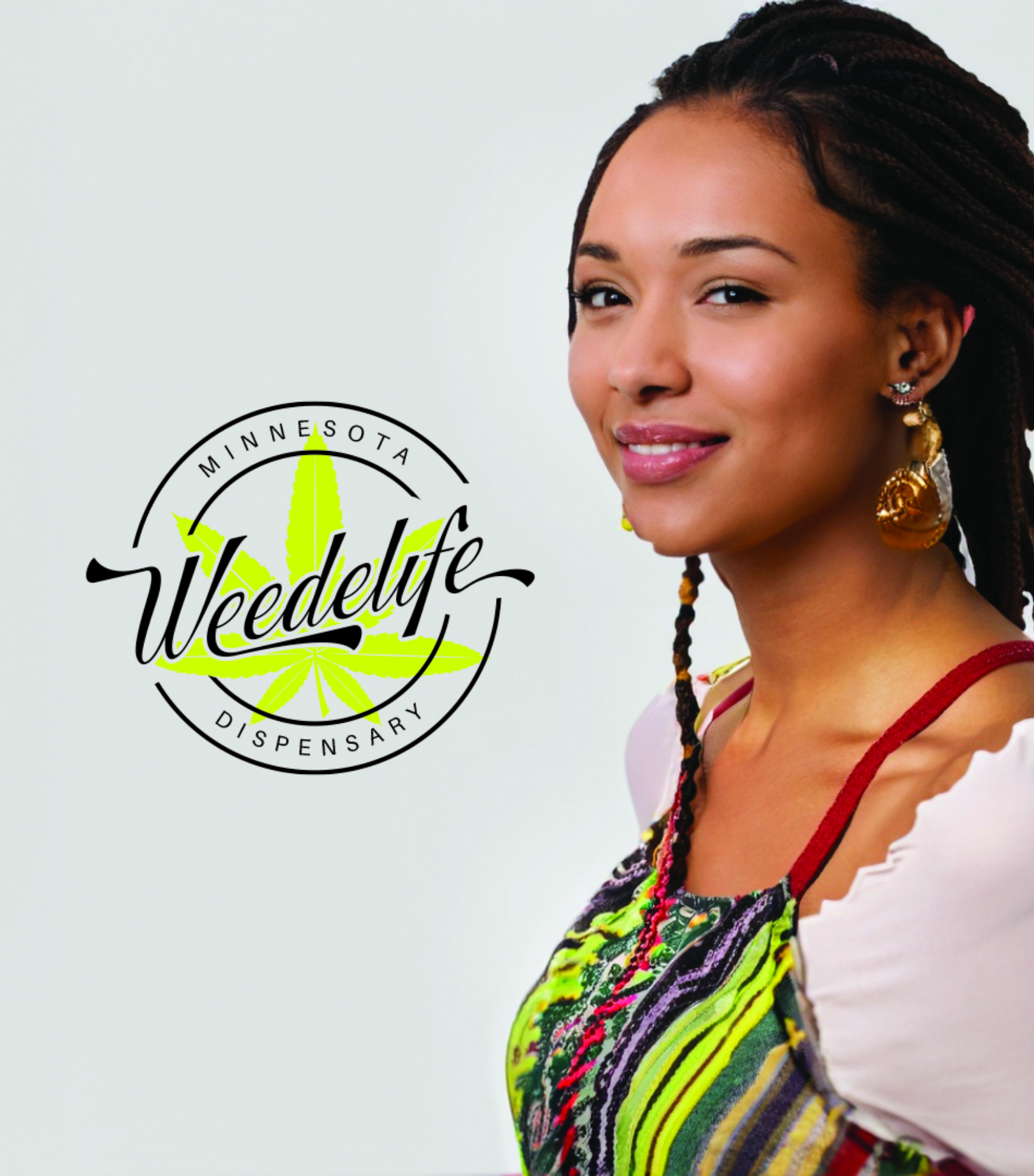
Brand Description
Weedelife is a premier Minnesota dispensary offering high-quality, authentic cannabis products that promote wellness and community.
Logo Description
The Weedelife logo features a marijuana leaf in a circle, symbolizing our natural, holistic approach and unity. The modern font and angled name reflect our professionalism and innovation.
Challenge
Create a distinctive logo that embodies Weedelife’s commitment to quality, nature, and community.
Idea
Design a logo that visually represents Weedelife’s values of quality, authenticity, and a holistic approach.
Creative Strategy
Utilize the marijuana leaf and circle for a balanced design, with colors symbolizing nature and vibrancy, ensuring legibility and a modern, professional look.
The Mark

Clear Space
The Weedelife logo needs ample clear space to ensure
visibility and legibility across mediums.
This balanced spacing enhances its recognition and overall
effectiveness.
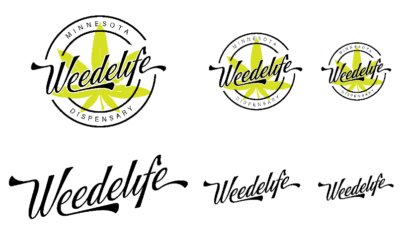
Primary Mark
The logo, a marijuana leaf within a circle, symbolizes natural wellness and unity. Ensures visibility and legibility across all mediums.

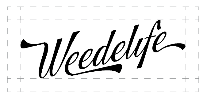
Secondary Mark
The secondary mark, ensures brand recognition and versatility. This clear, modern wordmark reflects our professional approach.
Minimum Sizes
The Weedelife logo's minimum size ensures clarity and legibility. Primary mark should be no smaller than 1 inch in diameter, and secondary mark no smaller than 0.5 inches in height.
White Monochrome
The Weedelife logo in white monochrome ensures clarity on dark backgrounds. This version maintains brand consistency and visibility across various applications.
Green Monochrome
The Weedelife logo in green monochrome provides a natural and consistent look on light backgrounds. This version ensures visibility and reinforces our brand identity.
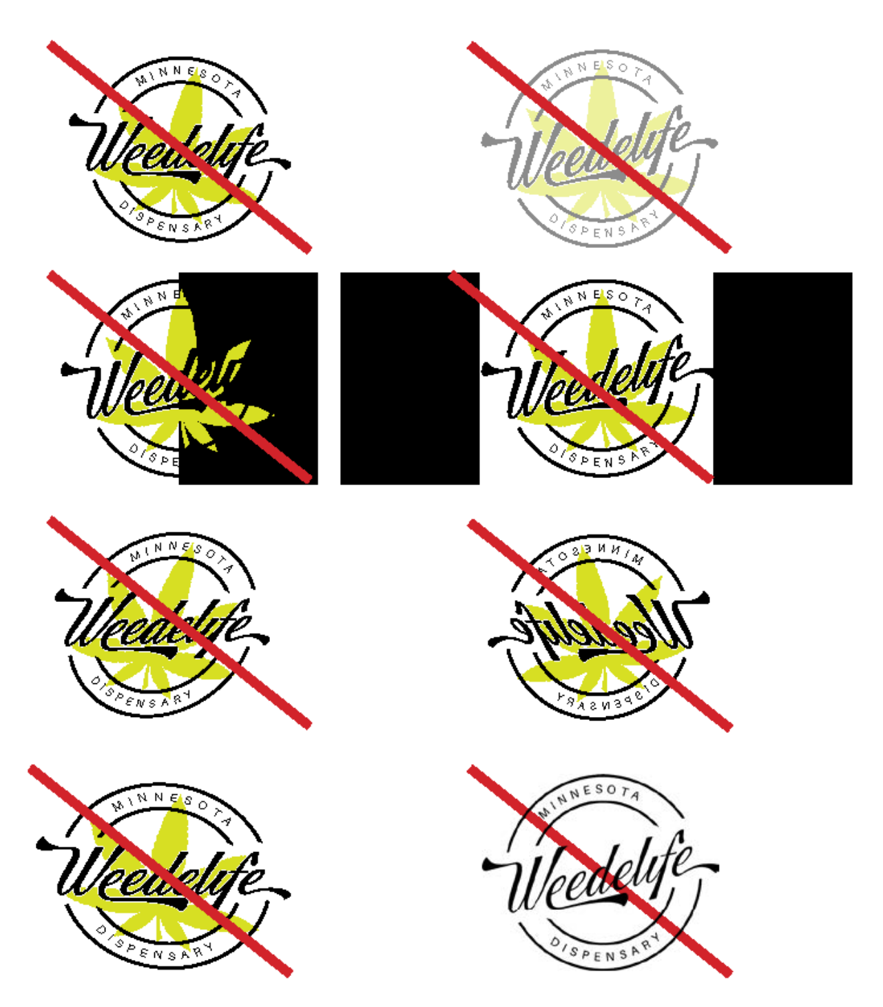
Misuse of Mark
Avoid altering the Weedelife logo's proportions, colors, or
orientation.
Do not add effects or place the logo on cluttered backgrounds.
Colour
Colour Scheme
Weedelife's branding colors enhance the brand’s natural, vibrant, and professional image. They ensure visibility and consistency across all applications.
Complementary secondary colors enhance the primary palette by adding warmth and depth, while maintaining a natural and cohesive look.
Primary Colours
#D7DF23
Pantone
396 C
#000000
Pantone
Black C
#008E6A
Pantone
7724 C
#FFFFFF
Pantone
White
#DEEBE5
Pantone
7541 C
Secondary Colours
#F4A261
Pantone
7413 C
#264653
Pantone
7546 C
#E76F51
Pantone
7417 C
#2A9D8F
Pantone
7712 C
#BC6C25
Pantone
7572 C
Typeface
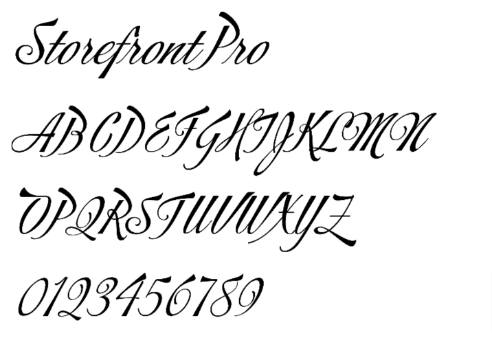
Main Title
The main typeface, a modified Storefront Pro, combines modernity and professionalism. It enhances brand recognition and readability. This custom touch reflects Weedelife's unique identity and innovative approach.
Sub-header
The secondary typeface, Aileron, offers a clean and versatile look. It complements the main typeface, enhancing readability and maintaining a cohesive brand identity.
Aileron Regular
ABCDEFGHIJKLMN
OPQRSTUVWXYZ
0123456789
Aileron Regular
ABCDEFGHIJKLMN
OPQRSTUVWXYZ
0123456789
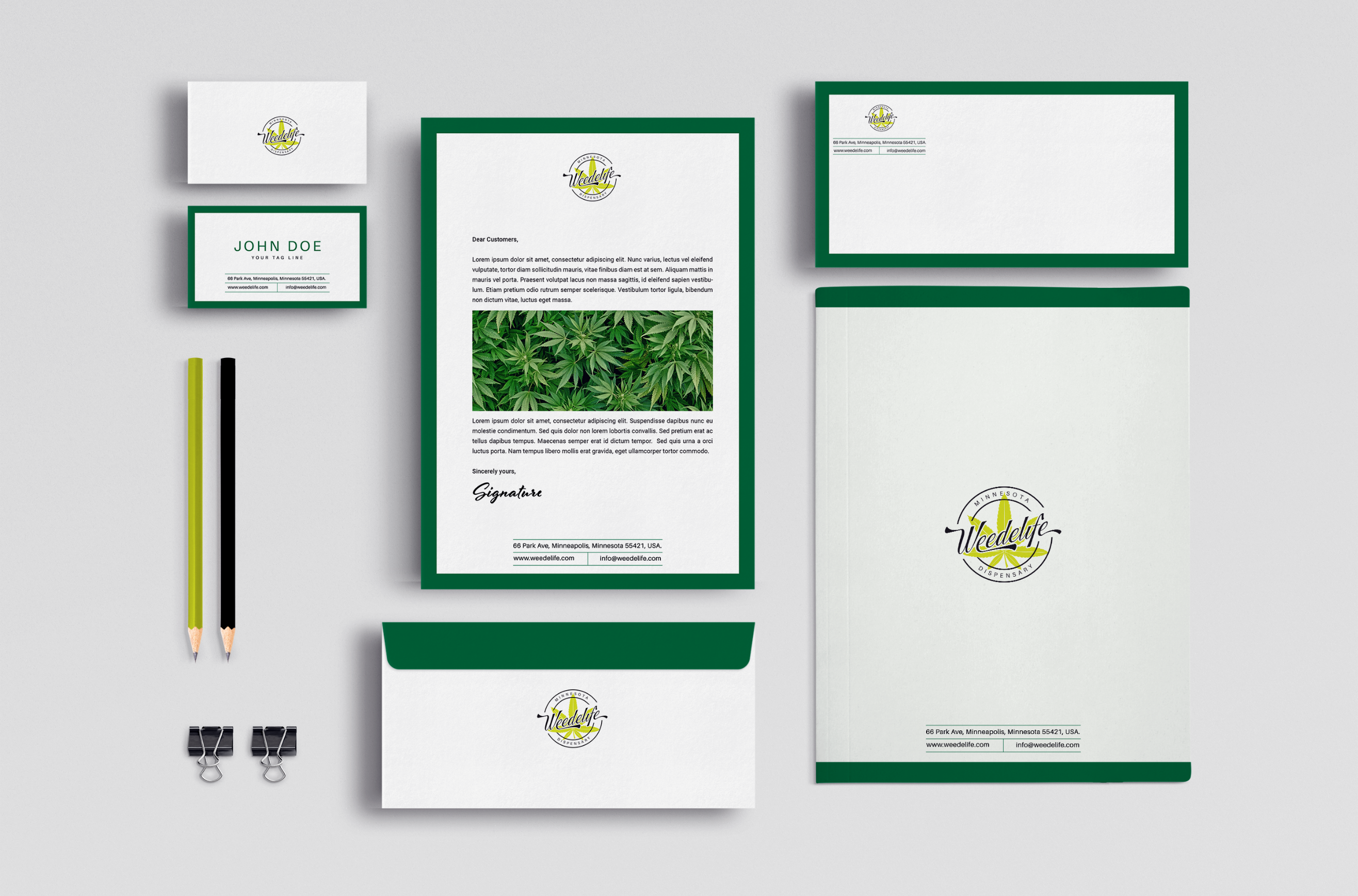
Stationery
The Weedelife logo and brand colors ensure a cohesive and professional presence on all stationery. This consistent application reinforces brand identity and visibility.
Imagery and Digital Application
The Weedelife brand ensures consistent use of imagery and design elements across all digital applications, including mobile and online platforms. High-quality visuals and brand colors are used to maintain a cohesive and engaging user experience. This consistency enhances brand recognition, strengthens our visual identity, and ensures a professional and appealing presence across all digital touchpoints.
Laptop or Desktop Screen
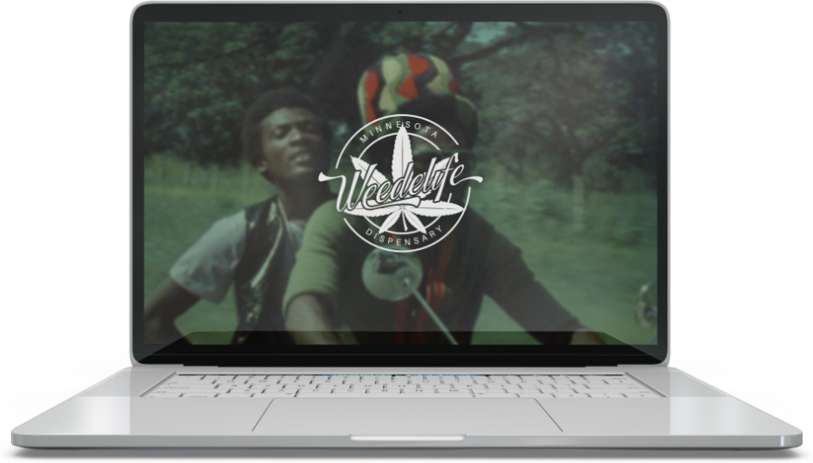
The Weedelife brand ensures clarity and appeal on computer screens with high-resolution images and consistent colors. The logo and typefaces are optimized for digital display to ensure legibility. This approach provides a professional and engaging online experience.
Mobile Application
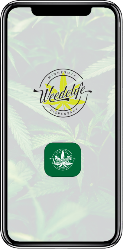
The Weedelife brand maintains clarity and appeal on mobile devices with optimized images and consistent colors. The logo and typefaces are tailored for small screens to ensure legibility. This approach ensures a professional and engaging mobile experience.
Web Application
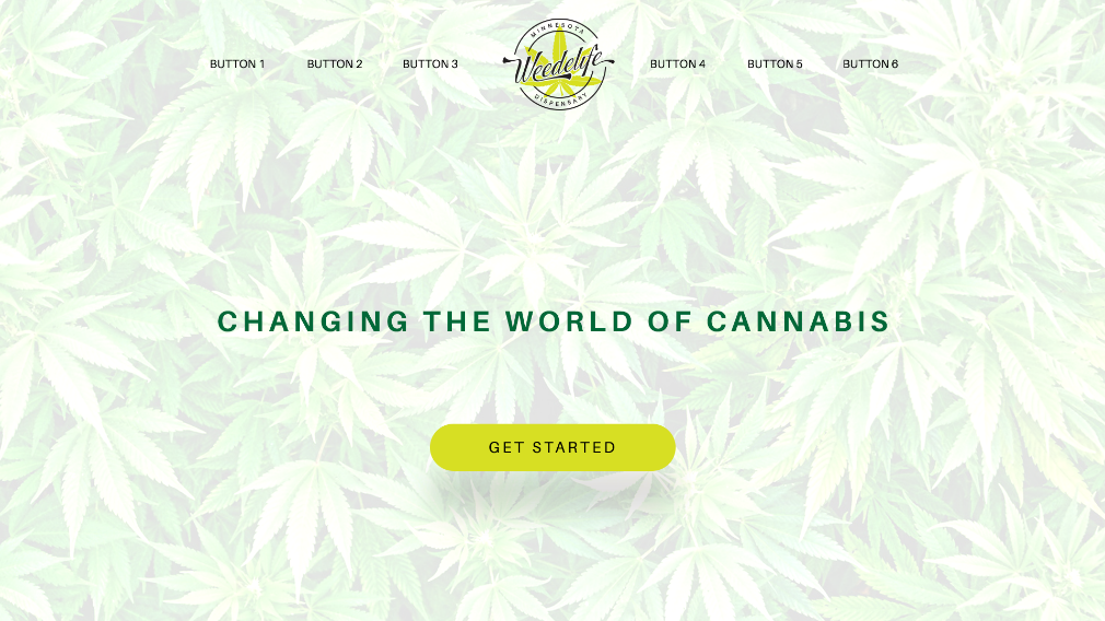
The Weedelife brand ensures a cohesive and engaging presence on websites with high-resolution images and consistent colors. The logo and typefaces are optimized for web display to ensure clarity and legibility. This approach provides a professional and appealing online experience across all web pages.