Out-of-Home · Multi-Industry
Billboard & OOH Campaigns
Broadcast · Real Estate · Retail · Environmental Design
Out-of-home demands a different discipline than any screen-based medium. You have seconds — sometimes a fraction of one — to land a message at highway speeds, at a bus shelter, or on the side of a building. Over fifteen years and across multiple industries, I've designed OOH campaigns for a major network TV affiliate, luxury real estate, and consumer retail brands — each with its own visual language, audience, and urgency. Every execution started from the same question: what's the one thing this needs to say, and how do we make it impossible to ignore?
Each employer brought a different problem — a TV station competing for viewers in a crowded market, and a luxury developer building prestige across South Florida zip codes. The shared constraint was the same: seconds of exposure, no second chances. Every layout had to be bold enough to stop traffic and disciplined enough to leave nothing to chance.
Regardless of industry, I built every OOH campaign around a strict visual hierarchy: dominant focal point, single primary message, supporting brand mark — in that order. Typography choices, color relationships, and image framing were all evaluated at thumbnail scale before anything was taken to full size. A design that doesn't read at 10% never works at 14×48.
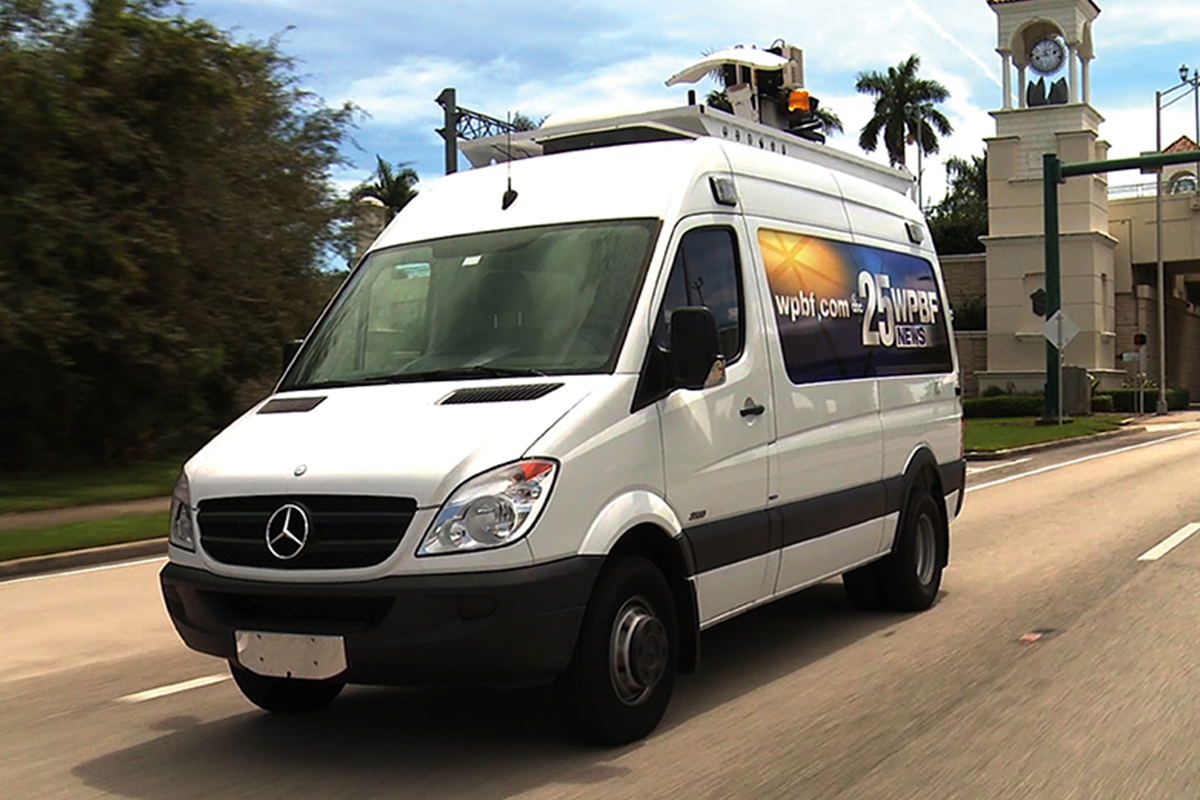
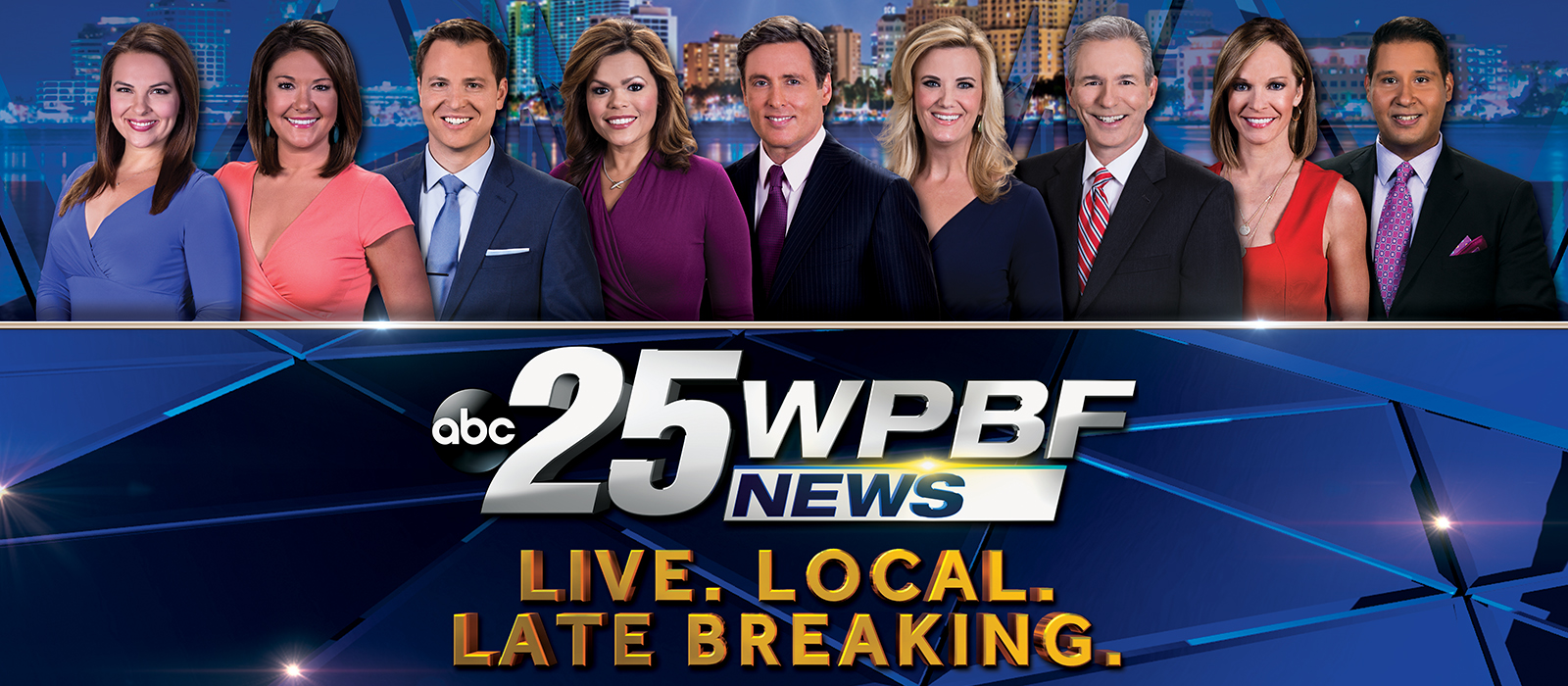
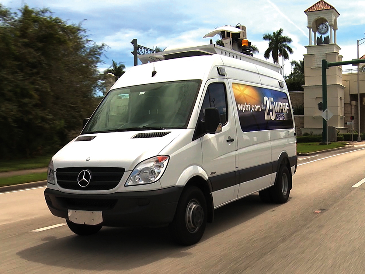
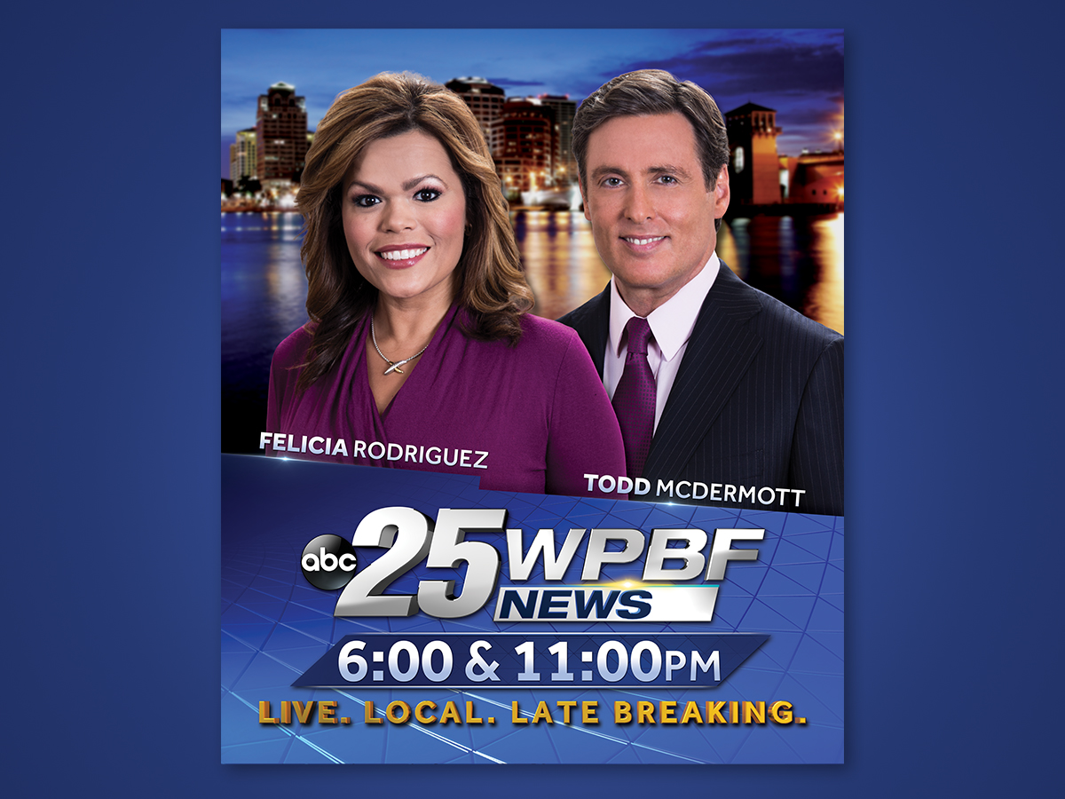
The bulk of my OOH career was built at WPBF 25, ABC's Palm Beach affiliate. As the station's primary designer, I concepted and produced outdoor campaigns to drive tune-in for newscasts, sweeps specials, primetime promotions, and station brand initiatives across the South Florida market. These campaigns ran on billboards along I-95 and the Turnpike, bus wraps throughout Palm Beach and Broward counties, and transit shelters from West Palm Beach to Boca Raton. Every campaign had to earn attention in a competitive local market while reinforcing the station's trusted, authoritative brand.
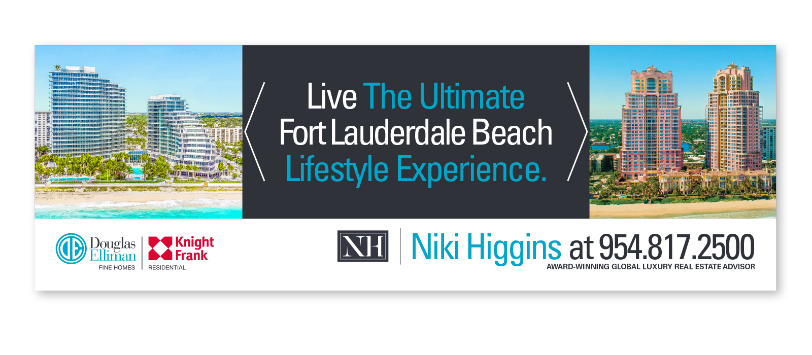
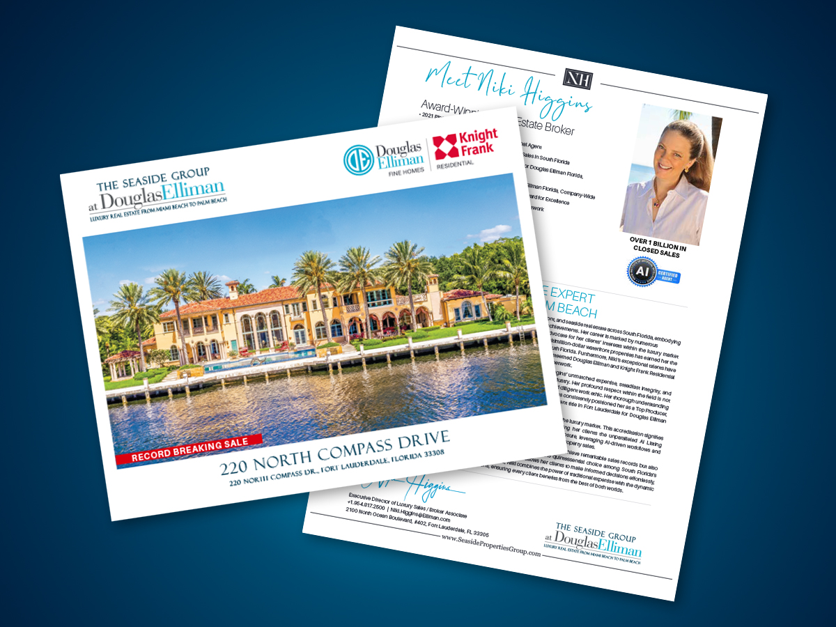
At Seaside Properties Group, the challenge shifted from tune-in urgency to brand prestige. OOH had to communicate status, aspiration, and exclusivity in a single glance — often at highway speeds along A1A and I-95. I developed a modular design system adaptable across billboard, transit, environmental, and print formats. Each execution paired a strong hero image with restrained typography and deliberate negative space, reinforcing the brand's premium positioning at every scale while driving qualified inquiry volume at new community launches.